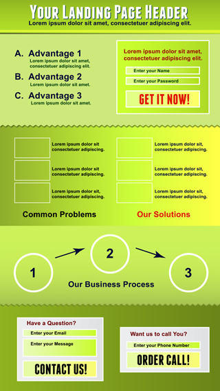
Frustrated with your internet marketing efforts? Not getting the results you hoped for? There are many reasons that internet marketing efforts under-perform. One of the elements centric to internet marketing success is developing quality landing pages. Landing pages give your visitors a place to do business, a place to take action…think of it as a funnel that you get to point in whichever direction you want your customers to go.

So what exactly are the components necessary for the perfect landing page?
You’ve probably heard this a million times, but it cannot be stressed enough! Landing pages must absolutely revolve around taking action. They are the last place you want to give a long-winded spiel about your company’s benefits or how amazing your new product is. The goal is for your visitor to TAKE ACTION. Like buy. Or give you their email address. Or sign up for your newsletter. Whatever it is, make your entire page funnel into that click. And make sure that the button or form is above the fold…it should be one of the first things a visitor sees upon landing on the landing page.
A great call to action will compel your visitor; it will provide a “pay-off” or something that motivates and inspires action. You have to give people a good reason to do whatever it is you are asking them to do. Also make sure that the design stands out. Use contrasting colours or large buttons to make it super clear what you want visitors to do. If you are using buttons for your call to action, use specific terms like “Sign up” or “Buy Now” rather than a generic term like “Submit.” This makes it crystal clear what the person is doing by clicking.
This is one of the first things that traffic directed to your landing page will see. If you haven’t taken the time to think through some catchy headlines, then you need to do it now! There are no big secrets to writing great headlines, but just writing a sassy headline won’t necessarily get you sales. A headline that sells needs to keep a few things in mind:
First of all, it’s got to be short and sweet. Visitors typically spend less than three seconds reading a headline; so to actually get your message across you’d better make it powerful and brief. Next, make sure that your headline is relevant to your ad’s message (or newsletter or email blast—whatever medium you used to send people to your landing page). If possible, include the main benefit right in your headline. Tell people straight out what’s in it for them.
The benefits must be straight up-front on your landing page. You want to drive home your message in a manner that leaves no doubts in your visitor’s mind. Make sure you spell out what your customer will get from doing business with you. Leave no doubts in their mind. Use language that is confident and clear, but don’t use underhanded tactics.
A key here is to build trust by using any factors that may boost your credibility. If you’re a member of the Better Business Bureau, then include their badge on your landing page (and other web pages). If you’re partners with other organizations, have credentials, affiliations or security badges etc. your landing page is the prime location to display these things; in fact you need to display these all over your website! You want visitors to feel comfortable with your business and to feel that it is safe to purchase from you. Testimonials and quotes from other happy customers are a great way to do this too.
Those are the top three components that will contribute to a successful landing page. If you don’t have time to build landing pages yourself, we can do it for you. We know how to develop and integrate targeted landing pages to get results for your business. Call us today!