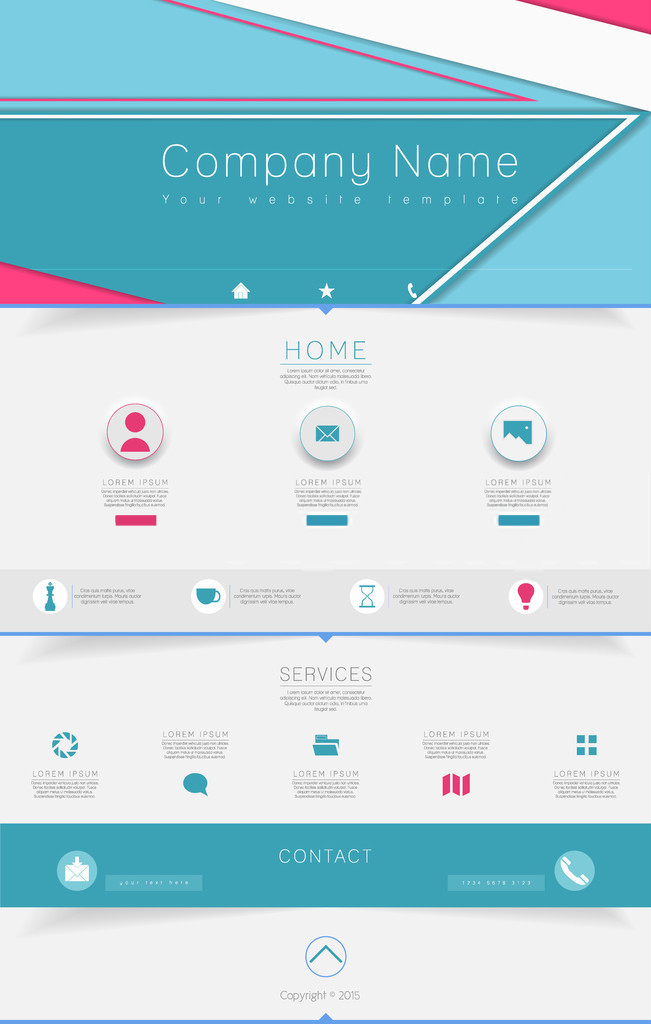
The look and feel of the web is an ever-evolving aesthetic. What seemed fresh and contemporary just two or three years ago now appears horribly outdated, and what seems in the minute right now will likely be old hat by 2017. Therefore, it’s always a good idea to review current principles of website design.
What looks like 2015? What website usability factors should you be focusing on? And how does your site’s design influence your conversion rates? Here are six principles to look for in other sites and incorporate into your own.
1. Eschew flat design, embrace material design.
“Good design is as little design as possible,” as the famous Dieter Rams line goes, and material design celebrates this attitude 100%. An evolution from the flat design that was omnipresent just a few years ago, material design dictates that icons and graphics take their cues from reality but eliminate as many extra lines and embellishments as possible. To really see material design in action, look at the icons of the native apps in Apple’s latest iOS.
2. Make everything easy to find.
The last thing you want to do is send eager, well-meaning visitors on a scavenger hunt. With this in mind, position your site search field so that it’s easy to find, give users an easy way to get back to the home page, and streamline the overall navigation. Plus, keeping the whole site to a single window is always best; too many windows can be difficult to keep tabs, especially on mobile devices.
3. Don’t be a tl;dr.
Internet shorthand for “too long; didn’t read,” tl;dr is the general attitude that most web users give to huge blocks of text that they don’t want to take the time to go through. Be pithy in your content, use short paragraphs and bullets to break up the text, and number items in lists.
4. Mind the mobile.
With so many web users on mobile devices, it’s absolutely essential to utilize responsive design that optimizes your site for smartphone users. Additionally, if you give visitors on smartphones the option of looking at the non-optimized version of your site, call it the “desktop” version rather than the “full” version. Using the latter term gives the impression that the mobile site is limited — a big turn off to visitors on smartphones.
5. Activate click to call.
Keeping in step with designing for a mobile audience, the click to call feature is incredibly helpful for users who want to get in touch with your business in a more old fashioned way. They see the number on their smartphone browser, they tap it, and within seconds, your line is ringing. Otherwise, you make users manually enter your number, leaving room for errors and, even worse, customers abandoning their intent to call you.
6. Create a clear call to action.
When visitors first arrive on your homepage or landing page, what should they do? The answer to this question should be clear, and, if necessary, the ability to do it should be front and center. For example, if your goal is to get visitors to sign up for your mailing list, a field in which they can enter an email address should be ready and waiting.
Adeo Internet Marketing is the marketing agency for Montreal companies and businesses from all over look to help with their website design, social networking, and communication strategies. How can we help your business thrive? Give us a call at (877) 841-5386, and let’s get the ball rolling.